How to Mix Flower Colours With Confidence
Most mixed bouquets fail not because of the flowers chosen but because of how the colours relate to each other. Understanding a few basic principles produces arrangements that look intentional.
The reason supermarket mixed bouquets so often look unsatisfying is not the quality of the flowers but the colour relationships between them. Flowers chosen because each one is individually nice, rather than because they work together, produce an arrangement that looks assembled rather than considered. The reverse is also true: flowers chosen with attention to how their colours interact produce something that looks professional even when the arrangement itself is simple. You do not need training to achieve this. You need a few reliable principles.
The case for monochrome
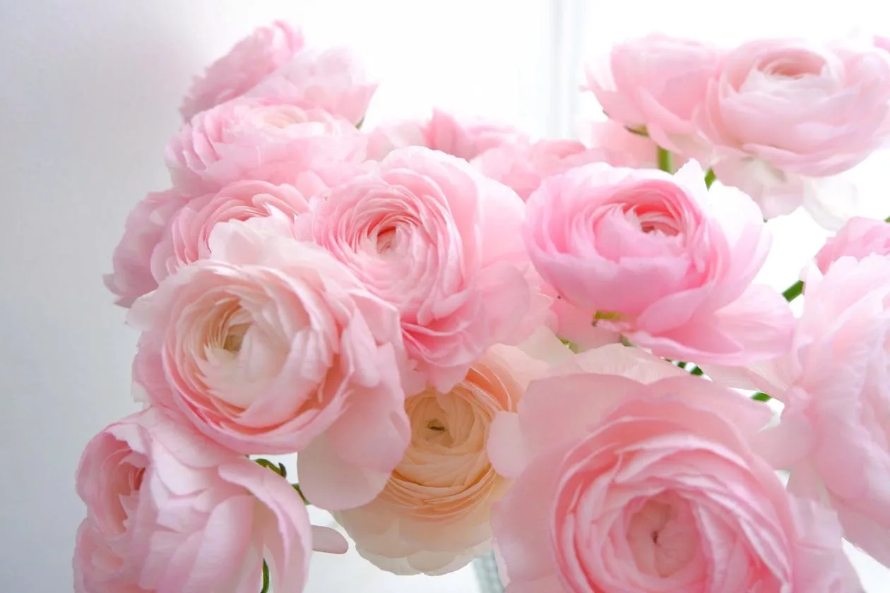
The simplest and most reliably successful approach to flower colour is to use variations of a single colour. An arrangement of flowers in all tones of pink, from pale blush to deep magenta, has coherence and visual impact that a mixed-colour arrangement struggles to match. The tonal variation provides enough interest to avoid monotony while the colour unity provides the visual satisfaction of order. All-white arrangements work for the same reason, as do all-yellow, all-peach, and all-blue-purple arrangements.
Adjacent colours
Colours that sit next to each other on the colour wheel, known as analogous colours, naturally harmonise. Pink and peach. Orange and yellow. Purple and blue. Red and orange. Arrangements built on adjacent colour relationships feel cohesive and warm. A combination of deep magenta ranunculus, coral-pink peonies, and peachy sweet peas works because the colours are moving along a warm spectrum rather than jumping across the wheel.
Contrast that works
Contrasting colours, placed opposite each other on the colour wheel, can produce electric combinations when handled well: orange and blue, yellow and purple, red and green. Most flower arrangements that use contrast do so accidentally and badly, producing a garish rather than striking result. If you want contrast to work, use it with intention: a dominant colour and a small quantity of its opposite as an accent, rather than equal quantities of both.
Reliable colour combinations for home arrangements
- All tones of white and cream: universally elegant, suits any interior
- Blush, peach, and coral: warm, romantic, works in spring and summer
- Yellow and orange: energetic and cheerful, ideal for kitchen and dining table
- Purple, blue, and violet: cool, sophisticated, dramatic in the right setting
- Deep red, burgundy, and dark pink: rich and warm, works from autumn through winter
- White with one accent colour: the most versatile approach for any season
“The most beautiful arrangements are rarely complicated. They are simply ones where the colours have been thought about rather than accumulated.”
The role of green foliage
Green foliage in an arrangement acts as a neutral that separates colours and prevents them from fighting each other. Eucalyptus, ruscus, fern, and similar greens create breathing space in a mixed arrangement, allowing the eye to move between the flower colours without confusion. Arrangements without any foliage tend to look denser and more formal; those with generous greenery look wilder and more naturalistic. Neither is wrong, but understanding what foliage does helps you choose deliberately.
Continue reading

How to Arrange Flowers Like a Florist
Professional flower arranging looks effortless because the principles behind it are simple. Learn the same techniques florists use and your arrangements will immediately improve.
Read more →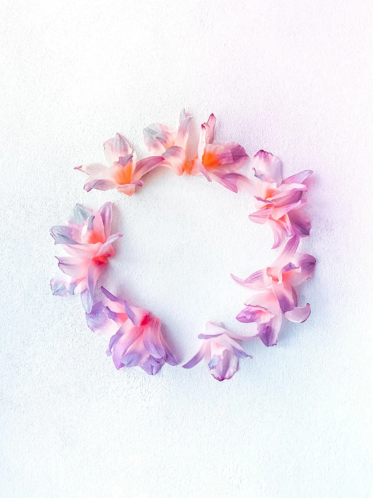
Using Flower Colour in Interior Design
Flowers are one of the most flexible and temporary ways to introduce colour into a room. Understanding colour theory makes it easier to choose flowers that complement or deliberately contrast with your interior.
Read more →
Spring Flowers for the Table: Simple Arrangements That Work
A table arrangement in early spring does not need to be complicated. It needs seasonal flowers, the right vessel, and the confidence to resist over-engineering.
Read more →