Using Flower Colour in Interior Design
Flowers are one of the most flexible and temporary ways to introduce colour into a room. Understanding colour theory makes it easier to choose flowers that complement or deliberately contrast with your interior.
The colour of a flower arrangement affects how a room feels in ways that are immediate and surprisingly powerful. A bunch of sunny yellow sunflowers in a grey London flat in January changes the emotional register of the space in a way that is out of proportion to its modest size. A deep burgundy arrangement in a cream and walnut sitting room adds exactly the warmth and depth a paint colour cannot. Flowers offer interior designers something unique: temporary, seasonally changing colour that can be updated every week.
Complementary versus harmonious colour
There are two basic strategies for flower colour in a room. Harmonious colour means choosing flowers that share tones with the existing palette: soft blush and cream flowers in a warm neutral room; blue and purple flowers in a cool grey-blue interior; terracotta and amber flowers in a room with warm earthy tones. This approach creates a sense of calm coherence. Complementary colour means choosing flowers that sit opposite the room's palette on the colour wheel: orange flowers in a blue room, purple flowers in a yellow-toned space. This creates visual tension and energy.
“Flowers are the only interior element you can change every week. They are the most responsive tool in the decorator's palette.”
White flowers: the universal solution
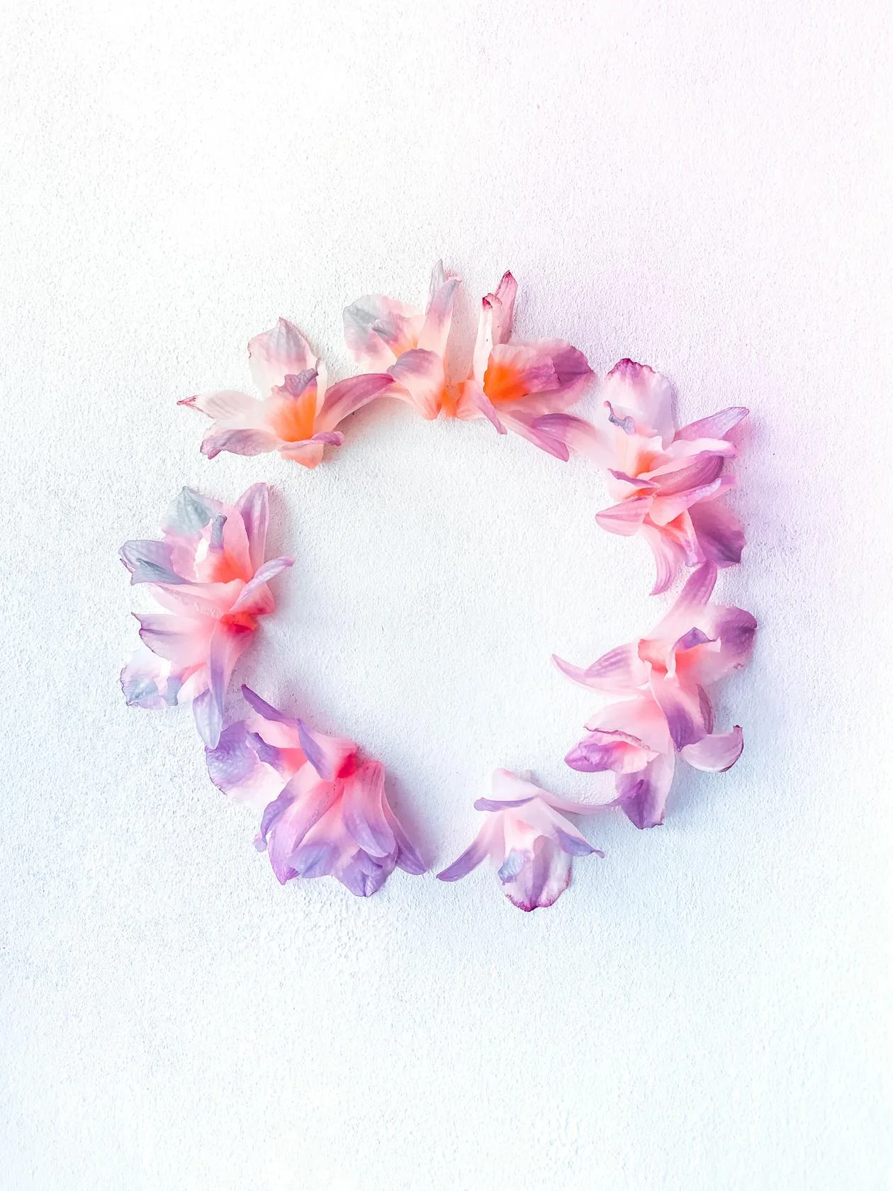
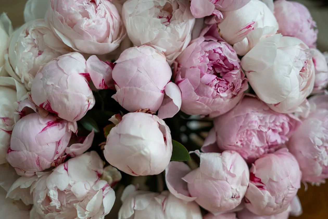
White flowers work in any interior and with any colour palette. They do not compete for attention, they do not clash, and they create a sense of freshness and clarity that coloured flowers cannot always provide. In a busy, heavily patterned interior, white flowers are the cleanest choice: they provide botanical presence without adding visual noise. In a very minimal or dark interior, they provide light. The risk with white flowers is blandness: variety of form compensates for lack of colour. A mix of white ranunculus, white anemones, and white sweet peas provides visual interest through form differences rather than colour contrast.
Seasonal colour as an interior design strategy
Using seasonally available flower colours as a design strategy means allowing the room's emphasis to shift across the year: pale blush and white in spring; bright primary colours and bold tropicals in summer; copper, amber, and deep red in autumn; white, cream, and deep purple in winter. This approach requires the interior itself to be relatively neutral, with colour coming primarily from textiles, flowers, and accessories. It creates rooms that feel genuinely responsive to the changing year rather than fixed in a permanent season.
Flower colour in interior design
- For a warm, neutral interior: blush, cream, peach, and soft coral work harmoniously
- For a cool grey or blue interior: white, pale lilac, and soft green complement naturally
- For drama in a calm room: use a single complementary colour in abundance
- White flowers are universal: they work with any interior at any season
- Consider the room's light: dark rooms benefit from warm, bright flowers; light rooms can handle cool tones
- Allow the season to guide the palette: fighting the season produces arrangements that feel wrong
- One strong colour statement beats many competing colours in a small arrangement
Continue reading
Flowers and Interior Design
The right flowers in the right space do something that furniture and lighting cannot. Here is how interior designers think about flowers, and how to apply it at home.
Read more →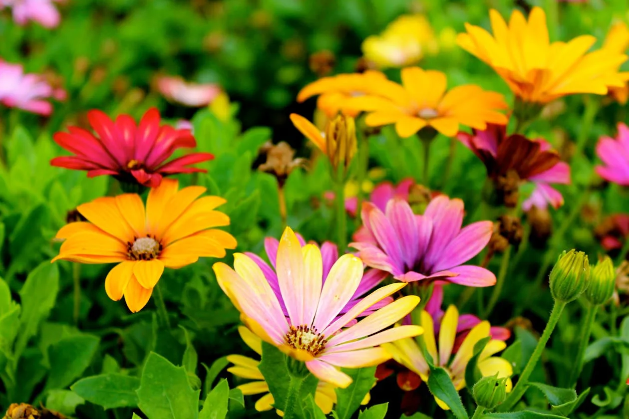
A Practical Guide to Flower Colour Meanings
Colour in flowers carries meaning that transcends fashion and tradition. Understanding what different colours communicate helps you choose more deliberately and receive more perceptively.
Read more →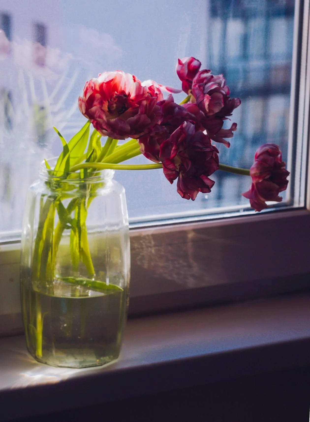
Choosing the Right Vase for Your Flowers
The right vase can make good flowers look great. The wrong one can make great flowers look mediocre. This guide will help you choose and use vases more deliberately.
Read more →